
655 Varley St, Yorkeys Knob, Queensland, 4878
The selection of colours for each space within this tropical home along an esplanade was guided by a thoughtful interplay of aesthetics and the desire to capture the essence of the stunning natural surroundings.
In the living room, the choice of seafoam green and soft blues was deliberate, mirroring the hues of the nearby ocean. These calming tones were intended to create a serene atmosphere, inviting the peaceful energy of the coastal landscape into the heart of the home. The inclusion of driftwood textures and sandy beige accents sought to enhance the organic feel, grounding the living room in the raw beauty of the beach.
Moving to the dining area, the decision to incorporate coral tones was not solely about visual appeal. Coral was chosen for its ability to infuse warmth and vibrancy, reminiscent of the sunlit beaches that define Far North Queensland. This choice aimed to create a dynamic contrast with crisp white furnishings, elevating the dining space to a realm of refined coastal sophistication. The use of sheer curtains allowed the gentle play of natural light, adding to the overall airy and inviting atmosphere.
The bedroom, designed as a personal retreat, was bathed in warm yellows and muted oranges to evoke the intimate and relaxing moments of a tropical sunset. Beyond aesthetics, these hues were chosen to create an environment that encourages rest and rejuvenation. The incorporation of bamboo accents and wooden furniture served a dual purpose – connecting the indoor space with the lush greenery outside while adding a tactile element that enhances the overall comfort of the bedroom.
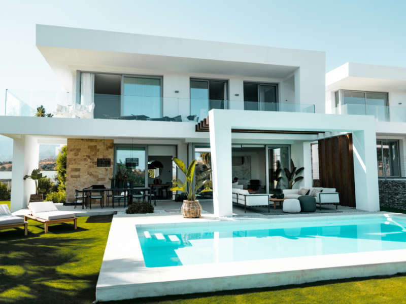
Outdoors, the harmonious blend of lush greens and tropical blues was inspired by the vibrant foliage and blooms found in the region. This color scheme aimed to seamlessly connect the indoor and outdoor spaces, creating a visual flow that extends the living experience to the natural beauty just beyond the doorstep. Accents of coral and sandy beige were strategically placed to tie the entire color palette together, ensuring a cohesive and balanced connection with the surrounding tropical landscape.
In essence, each colour choice was guided by a desire to not only please the eye but also to create a harmonious living environment that pays homage to the breathtaking beauty of Cairns’ coastal paradise. The carefully curated palette is a celebration of nature, woven into the fabric of the home to evoke a sense of tranquility, sophistication, and connection with the tropical surroundings.